
Platinum Naturals Rebrand
Packaging & Brand Identity


Platinum Naturals Rebrand
Packaging and brand identity
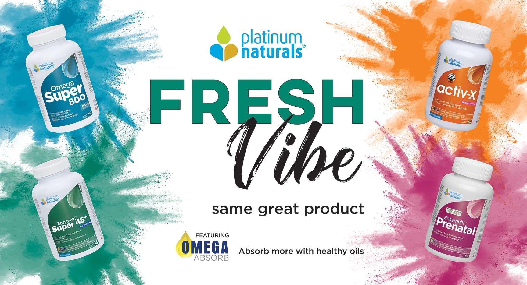
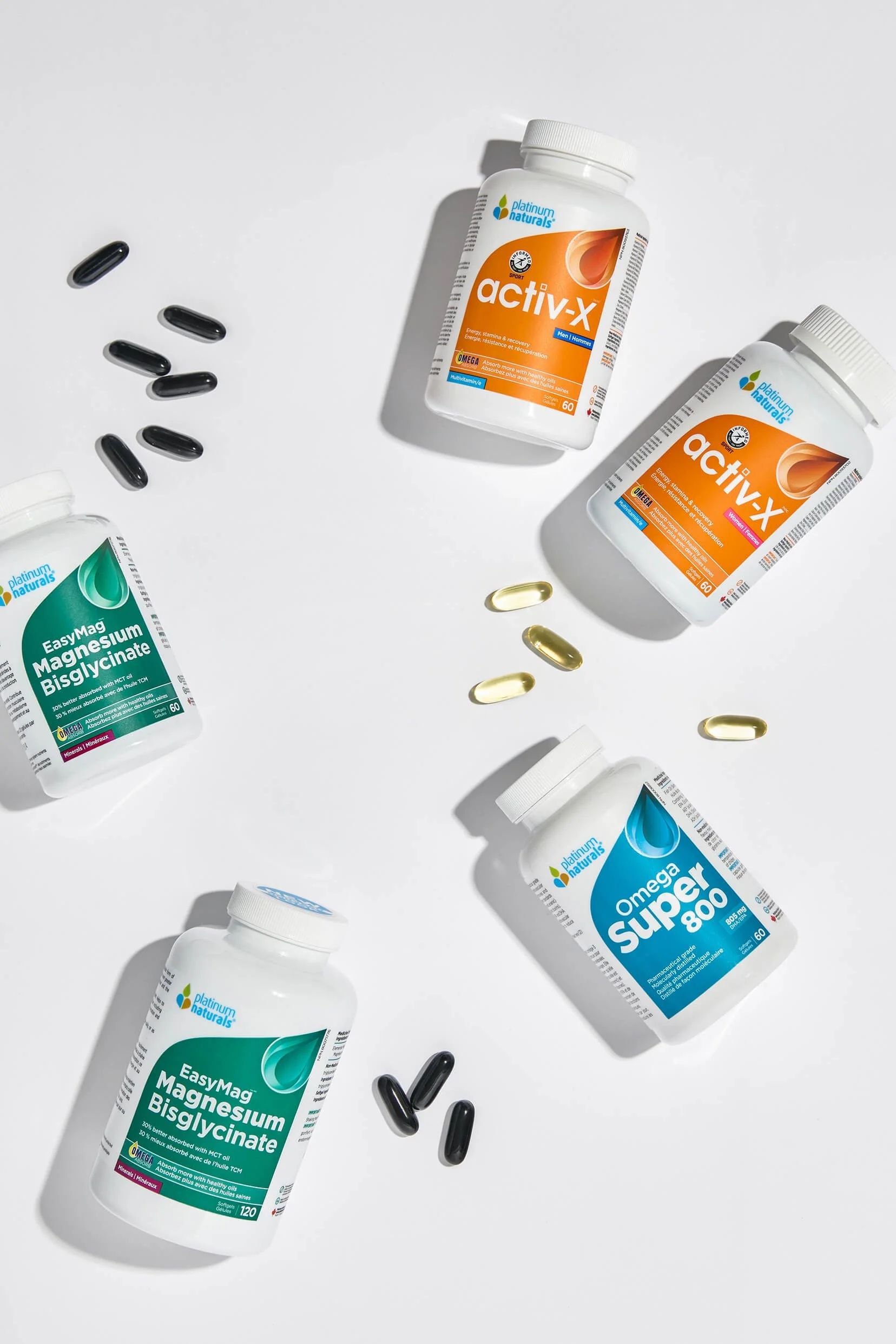
The primary objective of the rebrand was to create stronger shelf presence within an oversaturated category dominated by uniform white packaging. To achieve this, a bold colour-blocking system was introduced to clearly differentiate the brand’s four product categories, assigning each a distinct and recognizable colour identity.
A key brand element — the oil drop — was also reimagined through a more modern and refined visual approach. This evolved symbol reinforced the company’s core point of difference while creating a stronger, more contemporary brand language across the packaging system. The result was a cleaner, more impactful identity designed to improve navigation, increase shelf recognition, and strengthen overall brand perception.